

The Form Builder's user-friendly interface allows for creating seamless and engaging forms tailored for various marketing campaigns. Its structure is composed of steps, sections, and other key components that facilitate a smooth form-building experience.
Steps
Consider the "steps" in the form builder akin to slides in a presentation. Like moving through a slide deck, each step in the form builder guides visitors through manageable portions of the form. Each "slide" or step keeps information concise, clear, and interactive, ensuring visitors a seamless, engaging experience akin to a well-organized, captivating presentation.
Benefits of Multi-step Forms:
- Encourage visitors to make small commitments, boosting momentum and conversion rates.
- Offering a more interactive experience compared to traditional long forms.
- Adapt the message at each step for tailored user interactions.
- Segment leads based on their interactions and responses, ensuring targeted communication.
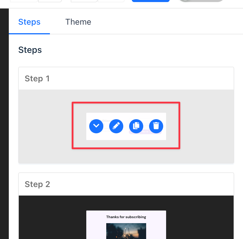
Managing Steps
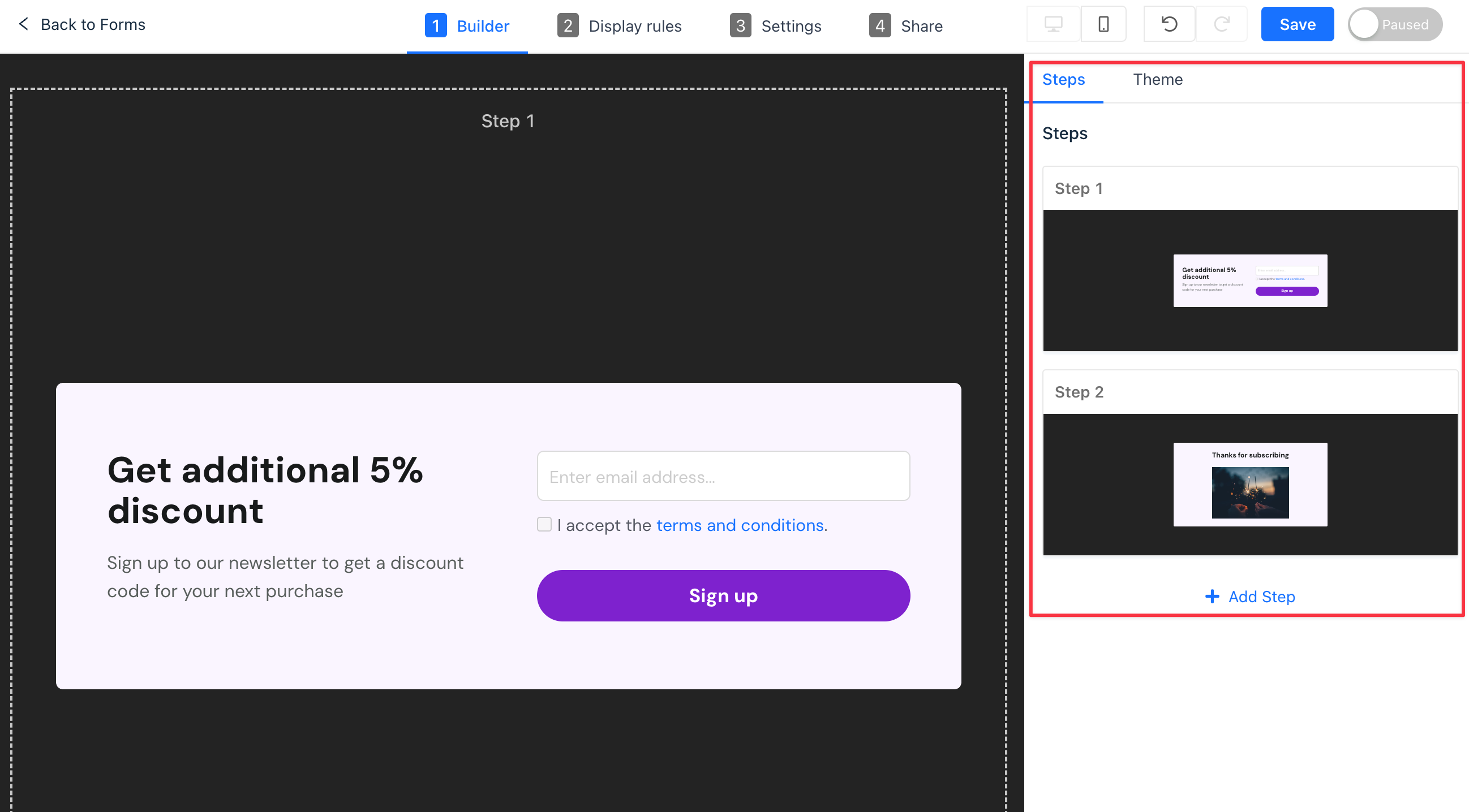
In the builder panel, locate the "Steps" tab. Here, you can perform various tasks:
- Add: Introduce a new step to your form.
- Delete: Remove unnecessary steps.
- Arrange: Order the steps to your preference.
- Edit: Modify a step to ensure it meets your requirements.
- Duplicate: Create a copy of a step for repetitive elements.
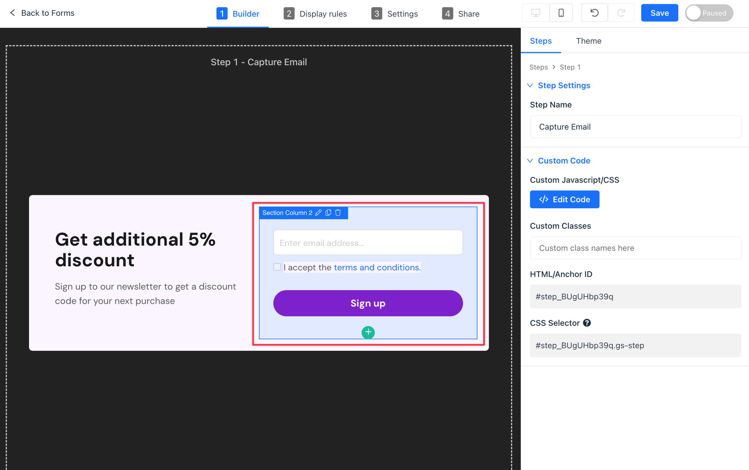
For a more personalized experience:
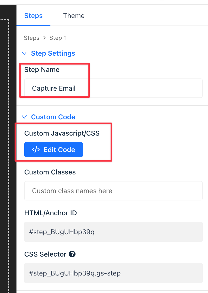
- Add your JavaScript/CSS to load upon reaching a step.
- Utilize skip logic to direct returning visitors based on predefined conditions.
Sections
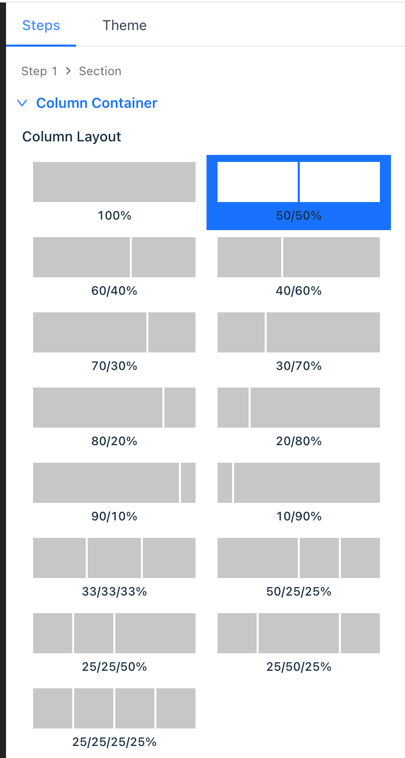
Each step within your form comprises "sections", which are essentially content blocks with various column layouts. You can access the section settings by clicking the Section in the builder.
Section Settings:
- Column Layout: Divide your section into 2, 3, or 4 columns of varying sizes.
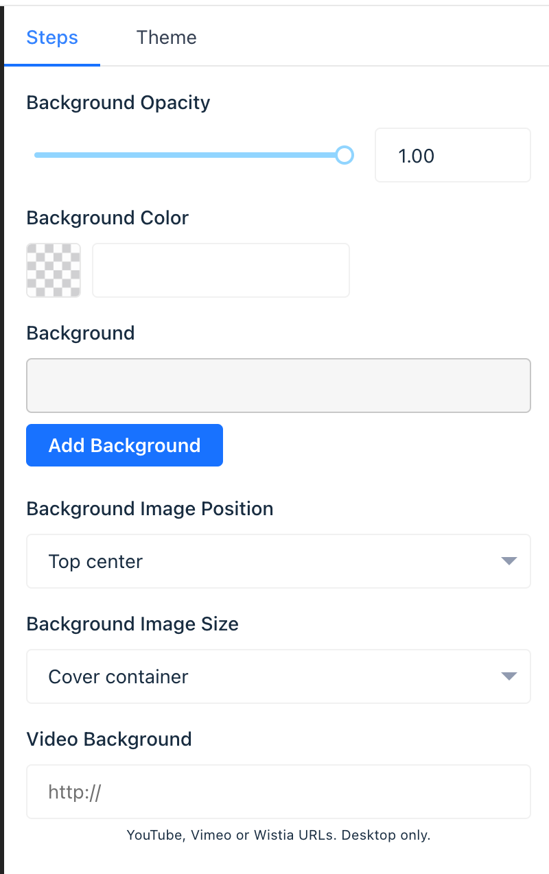
- Section Background: Modify the background by adjusting the color, adding an image, or incorporating a background video.
Column Settings
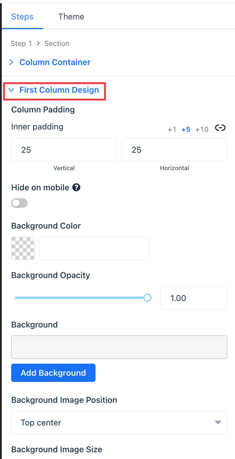
Directly click on the column to navigate to the respective settings in the section settings panel.
- Control padding, background color, and more.
- Design visually engaging form sections with unique background styles for each column.
Themes
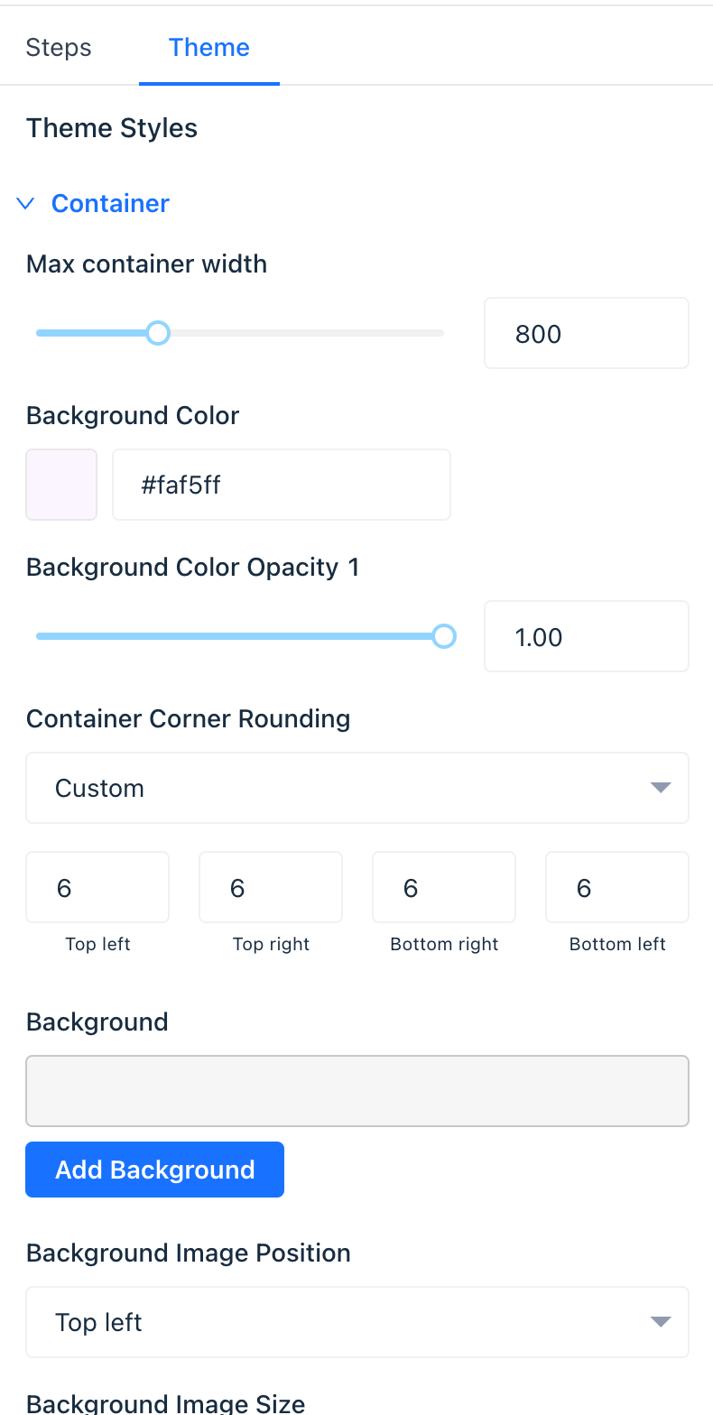
Utilize the theme tab to control default styles for the form container, headings, paragraphs, images, and more.
- Save brand fonts for easy access within the builder.
- Opt for dynamic templates personalized with your brand colors and fonts.
Pro Tip: If your existing form content uses element-level design controls overriding theme styles, select "Theme Default" to switch to the theme style for that element.
Elements
Every section column can house multiple elements to display desired form content.
Hover your mouse over any column and click the green plus + icon to add more elements to the column.

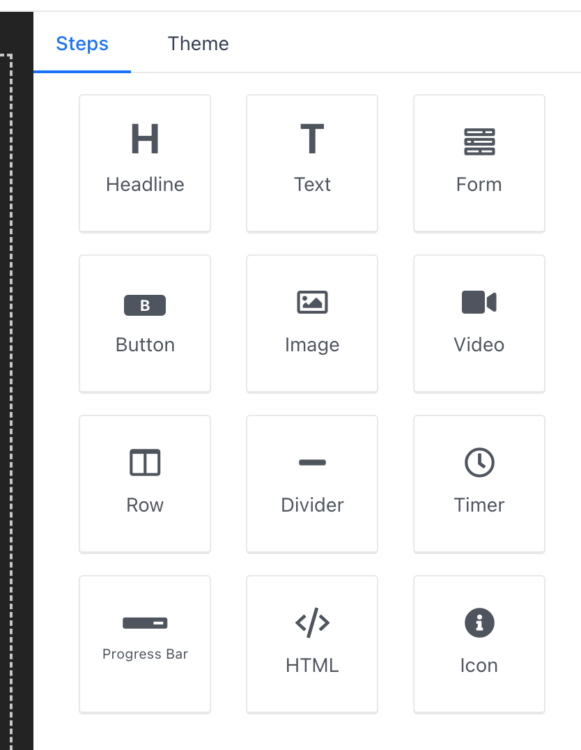
Types of Elements
- Headline Elements: Display styled headline text.
- Text Elements: Offer styled content blocks.
- Form Elements: Allow user information entry.
- Button Elements: Prompt visitors to navigate through pages or forms.
- Image and Video Elements: Showcase images or videos.
- Row Elements: Contain other elements in styled boxes.
- Divider Elements: Add horizontal and vertical divider lines.
- Timer Elements: Display a countdown timer with an end action.
- Progress Bar Elements: Visualize progress through forms or towards goals.
- HTML Elements: Add custom HTML to forms.
- Icon Elements: Include FontAwesome icons.
Positioning Elements
Easily position elements by dragging and dropping them inside columns.

Managing Elements
Upon selecting an element, use the top toolbar buttons to arrange, duplicate, or remove it.
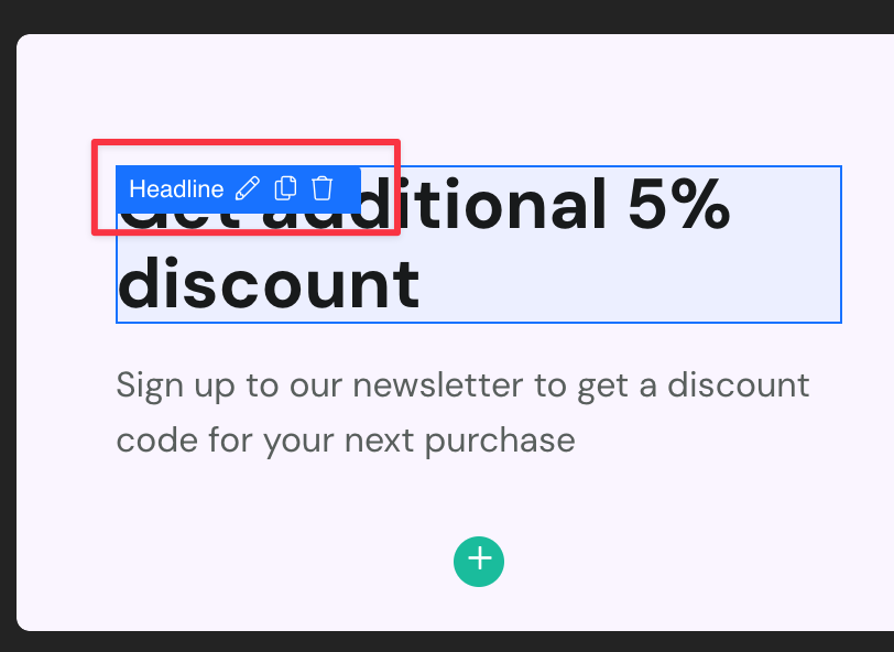
Editing Elements
For text elements like headlines, paragraph content, and button text:
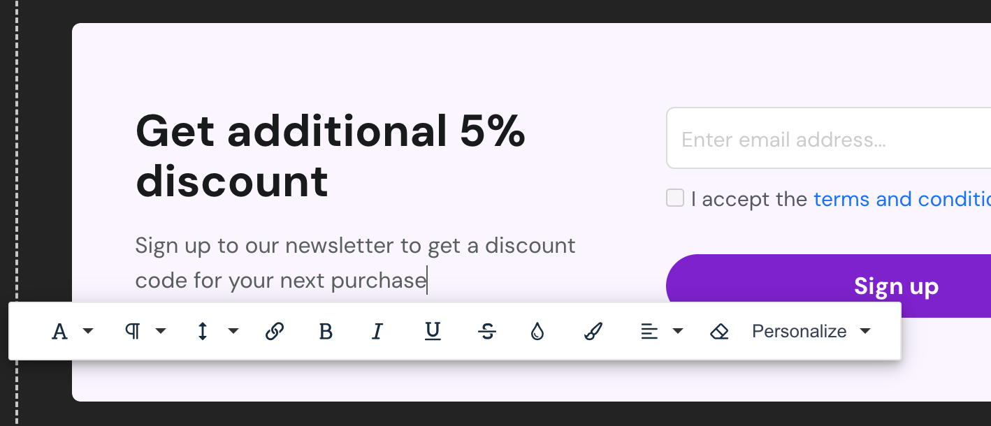
- Double-click to access the text editor.
- Customize content and styles.
- Utilize the "Personalize" text option to integrate merge tags for dynamic text replacement.
Element Settings
Select an element to reveal its settings in the builder panel:
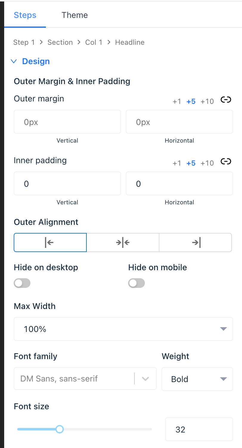
- Adjust spacing and outer alignment.
- Modify additional settings for forms and buttons.
Optimizing for Mobile Devices
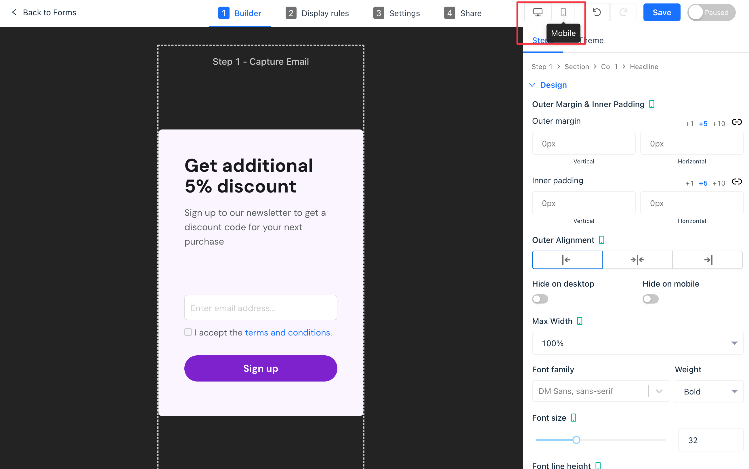
Ensure your form content is mobile responsive:
- Switch between desktop and mobile canvas by clicking the device toggle in the toolbar.
- Apply mobile-specific padding and alignment settings.
- Enable or disable elements and sections for different devices for tailored content presentation.
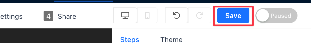
Saving your work
After making changes to your form, click the blue "Save" button at the top right of the builder panel.
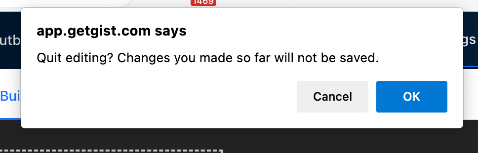
If you attempt to exit the builder without saving your changes, Gist will send you a reminder alert. This feature helps prevent accidental loss of data and ensures that your form is in the desired state before exiting.
Publishing your form
Once satisfied with your form and all changes are saved, click the Publish switch at the top right of the builder panel, next to the "Save" button.
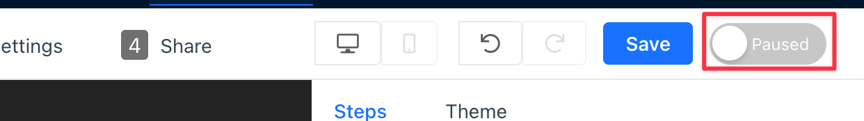 Your form is now live and accessible to visitors.